Enhancing PowerPoint Presentations with Data Visualization
PowerPoint presentations‚ while often associated with bullet points and dense text‚ can be significantly enhanced through the strategic integration of data visualization. Effective visuals transform complex data into easily digestible information‚ boosting audience engagement and comprehension. This requires careful planning and execution‚ however. By following best practices‚ you can ensure your visualizations not only look good but also effectively communicate your message.
Understanding Your Audience and Data
Before diving into chart creation‚ consider your audience’s background and understanding of the data. Are they experts in the field or newcomers? Tailor the complexity of your visuals accordingly. A highly technical audience might appreciate detailed charts with nuanced information‚ while a less technical audience might benefit from simpler‚ more visually intuitive representations. Equally crucial is a thorough understanding of your data. Identify key trends‚ outliers‚ and correlations before choosing a visualization type. This preparation will prevent misinterpretations and ensure your message is accurately conveyed.
Choosing the Right Chart Type
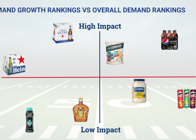
The type of chart you choose plays a pivotal role in the effectiveness of your visualization. Different chart types are best suited to different kinds of data and messages. Bar charts excel at comparing discrete categories‚ while line charts effectively illustrate trends over time. Pie charts are useful for showing proportions of a whole‚ but should be used sparingly as they can become difficult to interpret with many slices. Scatter plots are ideal for exploring relationships between two variables‚ revealing correlations or clusters. Consider the specific insights you want to highlight and select the chart type that best supports that goal. Avoid using charts simply for aesthetic appeal; the primary function should always be clear communication.
Designing for Clarity and Impact
Once you’ve chosen your chart type‚ focus on creating a visually appealing and easily understandable design. Keep it simple; avoid overwhelming the audience with too much information or intricate details. Use clear and concise labels for axes‚ data points‚ and legends. Choose a color palette that is both aesthetically pleasing and functional‚ ensuring sufficient contrast for readability. Avoid using too many colors‚ as this can make the chart cluttered and difficult to interpret. A consistent style guide across all your visuals will ensure a professional and unified look.
Color Palette and Font Selection
The impact of your visualization is significantly influenced by the color palette and font you choose. Select colors that are not only visually appealing but also convey the right message. For example‚ using warm colors (reds‚ oranges‚ yellows) can evoke feelings of excitement or urgency‚ while cool colors (blues‚ greens‚ purples) might suggest calmness or stability. Choose fonts that are easy to read and consistent with your overall presentation style. Avoid using too many different fonts‚ as this can create a cluttered and unprofessional look. A simple‚ clean font like Arial or Calibri is generally a safe choice.
Incorporating Visualizations into Your PowerPoint Presentation
Integrating your visualizations into your PowerPoint presentation requires careful consideration of placement and context. Don’t simply insert a chart and move on; integrate it seamlessly into your narrative. Introduce the chart‚ highlight key findings‚ and explain their significance. Don’t overload your slides with excessive text; let the visual do the talking. Use concise captions and annotations to guide the audience’s attention to the most important information. Ensure the visualization is large enough to be easily seen from the back of the room‚ and the resolution is high enough to maintain clarity.
Animation and Transitions
While animation and transitions can add a touch of dynamism to your presentation‚ use them sparingly and purposefully. Overusing animations can distract from your message and make your presentation appear unprofessional. If you choose to use animations‚ ensure they are subtle and enhance the understanding of the data‚ not detract from it. For example‚ you could use animation to gradually reveal data points or highlight key trends. Always prioritize clarity and understanding over flashy effects.
Avoiding Common Mistakes
- Overcomplicating Charts: Keep it simple. Too much data or overly complex charts confuse the audience.
- Poorly Chosen Chart Type: Select the chart type that best represents your data and message.
- Insufficient Labeling: Clearly label all axes‚ data points‚ and legends.
- Inconsistent Color Schemes: Maintain a consistent color palette throughout your presentation.
- Unreadable Fonts: Choose fonts that are easy to read from a distance.
- Excessive Animations: Use animation sparingly and purposefully.
Advanced Techniques for Data Visualization in PowerPoint
PowerPoint offers a range of built-in charting options‚ but for more sophisticated visualizations‚ consider using external tools. Software like Tableau‚ Power BI‚ or even Excel can create more dynamic and interactive charts that you can then import into your presentation. These tools allow for advanced features like filtering‚ interactive elements‚ and data drill-downs‚ which can significantly enhance audience engagement and understanding. The ability to interact with the data can lead to a more memorable and insightful presentation.
Interactive Elements and Data Drill-downs
Interactive elements‚ such as clickable charts or data drill-downs‚ can significantly enhance the audience’s experience. By allowing viewers to explore the data at their own pace‚ you can facilitate a deeper understanding of the information presented. Interactive elements can transform a passive presentation into an engaging and participatory experience. Think of how a click could reveal more specific details within a chart‚ providing greater context and meaning.
Maintaining Visual Consistency
Maintaining visual consistency across all your slides is crucial for creating a professional and cohesive presentation. Use a consistent color palette‚ font style‚ and chart design throughout. This will ensure that your message is communicated clearly and effectively‚ without distracting the audience with jarring visual inconsistencies. A well-designed presentation is not just about the content but also about the overall aesthetic experience it provides.
Consider creating a style guide for your visualizations‚ outlining preferred chart types‚ color palettes‚ fonts‚ and design elements. This will ensure consistency across all your presentations‚ creating a professional and recognizable brand identity. Consistency in design reinforces your message and enhances its credibility.
Leveraging PowerPoint’s Built-in Features
PowerPoint offers a surprising number of built-in features that can enhance your data visualizations. Explore the options beyond simple bar and pie charts. Experiment with different chart types to find the best fit for your data. Learn to utilize the formatting options to customize the appearance of your charts‚ ensuring they align with your overall presentation style. Master the art of utilizing labels and legends effectively. PowerPoint’s capabilities are often underestimated‚ offering a powerful‚ readily available tool for effective data visualization.
- Utilize SmartArt graphics for visually appealing representations of hierarchical or process-oriented data.
- Explore the various chart styles and formatting options to customize the appearance of your charts.
- Learn to effectively use data labels and legends to clearly communicate the information presented in your charts.
- Master the use of different chart types to convey various types of data effectively.


